Monday, April 10, 2017

Posh: Creative Critical Reflection

Here it is.... This is my creative critical reflection where I give you a little more insight into the creation of Posh.

Enjoy!


https://www.youtube.com/watch?v=cl2DHF0wP0k

Sunday, April 9, 2017

Posh: The Magazine

The end is finally here... As I attach the link to my magazine Posh and prepare to do my CCR, I just want to say thank you. I am extremely happy with my final product, and I hope you enjoy reading it as I did making it! This process has definitely inspired me to pursue more fashion-related projects like this, so I don't think it's the last time you see or hear about Posh...

Welcome to the first issue of Posh!

https://joom.ag/ockW

Lots of love. XOXO

Friday, April 7, 2017

The Final Curtain

I wish you guys could see the tear falling from my eye as I write this final post. This whole journey has been a crazy, stressful, unforgettable experience and opportunity that I will cherish for the rest of time. The hours of researching, planning, creating, and designing, made me open my eyes to new fashion-related platforms and ideas that I wasn't aware of before. This project has challenged me to look beyond my comfort zone, which is one of the things I have appreciated most about this project. So now that I have literally walked you through every step of my thought processes and decision making, what will you have to look forward to in the final project?

  • Bright, fun, bold colors
  • My spread a.k.a the best stying guide ever (which is actually taking me forever to perfect)
  • Yes, i decided to include a main cover line on the magazine
  • Edgy, modern, minimalistic elements
  • Lots of fashion lingo
  • A very personal note by me
  • Pictures & lists (check out this article from The New Yorker about why our brains love lists, which definitely served as major inspiration when creating my spread)
To be honest, you are probably picturing something completely different to what it actually looks like, happens to me all the time, just know two things: its nothing like you've ever seen before and its nothing short of awesome. In a few days I will finally reveal my magazine to the world, and I could not be more excited/anxious!

Wednesday, April 5, 2017

Front Cover Madness

Who is ready for some previews?? I have started editing, and I'm glad to announce that it isn't as difficult as I thought! In fact, Canva is pretty user-friendly and I am almost done. My double page spread is slowly coming together, except I think it will be more like a quadruple page spread (is that even a thing?) due to the fact that I can't fit the entire piece on two pages. As for my cover page, it is pretty much done, although I am just having trouble deciding between two pictures.


So between the two pictures, one is more "edgy" than the other due to the 3D effect. Since I started editing I had a bunch of ideas that have contradicted my initial goal of achieving an edgy look, which is why making this decision so difficult. Basically what is happening is that as I design my magazine, it is looking a lot less edgy than I hoped. This brings me to my point, I am afraid that the 3D cover will look out of place compared to the minimalistic, classy, and colorful aspects of the rest of the magazine. What would you do?

Another thing that I have yet to decide is whether I want to include the main cover line on the cover page. But one thing I know for sure is that I will definitely not be including a bar code, as it takes away from the ultimate aesthetic I want. Anyways, stick with me for more sneak peaks as the end draws closer and closer. 


Monday, April 3, 2017

Tackling Obstacles

The photoshoot was pretty exhausting and I did encounter a couple challenges, but overall, I am happy with the result. One thing that didn't go as planned was the fact that I was unable to achieve the pattern/print look that I originally intended because I was limited in the clothing I could use. Either way, I did include print-like pieces of clothing/accessories and bold colors with each outfit to match my color palette and general theme. Another challenge I ran into was the fact that I didn't have a tripod, so now I have to go through and tilt/adjust about 1,000 pictures to straighten the frame. I also have to crop most of the pictures that include elements that were not supposed to be in the frame, which has taken me longer than I thought. But, I do have to give myself some credit because for a first timer trying to photograph professionally, everything came out looking pretty good! Obviously, all of this would not have been accomplished without the help of my friend and model Laura, so a big shout out to her.

As soon as I finish editing the pictures, I will start actually creating the magazine on Canva. Although I did start playing around with the templates and fonts, I have yet to find/create the design that I LOVE. One thing that I am afraid of though, is that the pictures I took will not look good once I put them into the magazine template. I know putting my ideas into practice is definitely harder than what I originally imagined, so I am just hoping for the best at this point. For now, here are a few pictures from the shoot. (Keep in mind I will be cropping out the faces)


Stay tuned for some more previews in my next post!

Friday, March 31, 2017

Scheduling

Now that I finally know what my double-page spread will be about, I am planning to shoot and edit this weekend (hopefully). However, it is always possible that I may hate all the pictures, and in that case, I won't have time to redo the whole shoot. Either way, I am trying to think positive and if everything goes accordingly, it should flow perfectly.

For my double-page spread, I was really looking forward to combining pattern trends with street style, but thinking it over , I just feel like I will be way too overwhelmed with the streets, the people, and the model. With that being said, I will be making my own little studio and shooting at my house. Shooting in a controlled environment like my house, I have the freedom to chose the lighting, the background, and change the models outfits with no problem. I am planning to have a white background for my pictures to contrast with the bright colors/prints.

Now, who will be my model? I've asked one of my closest friends, Laura, to model the outfits for me.  But in reality, it doesn't matter who she is because like I previously mentioned, I will be cropping/covering her face. The main focus of my magazine will definitely be the clothes and the fashion, not the models.

I am SO excited to see how this will turn out, wish me luck!

Thursday, March 30, 2017

Pattern-mania

Following my research about street style, I took the liberty to also research more about the new pattern trend. I realized that I may be able to combine the two ideas into one, although maybe I won't explicitly call it street style, I will be able to give my audience styling tips and inspiration. Emily Shurr's piece for Papermag is literally pattern galore, although they may have taken it a bit too far in my opinion, it still serves its purpose. The bold colors and prints mashed together create a brilliant and abstract image, which really helps to make a statement out of the whole pattern trend. Emily Shurr LITERALLY outdid herself with this one.


OMG! Cutting off the model's face.. Doesn't that sound familiar?

Like I said, it is more dizzying than what I hope to do, but it does adequately outline the idea of doing my spread about patterns. I definitely want to combine prints/patterns with solid colors to give readers more insight into the trend and also provide styling tips, without making the outfits look borderline ridiculous. These photographs are slightly more similar to the looks I want to achieve, not only since it is less overwhelming but because it combines my original idea about street style with patterns.


Soon I will be posting all the information detailing when I will be shooting, with who, and where! Till next time. XOXO

Citations
"Emily Shur’s “Get Busy, Get Dizzy” for PaperMag." Trendland. Katrina Tan, 15 Aug. 2012. Web. 20 Mar. 2017. <http://trendland.com/emily-shurs-get-busy-get-dizzy-for-papermag/>.

Monday, March 27, 2017

Street Chic

Recently I've been really into street style chic, researching notable street stylers and drooling over their outfits. Obviously I can't get Alexa Chung or Miroslava Duma to model for me within the next two weeks, but I do think it would be really cool to take inspiration from them and do my own double-page spread on Miami street style. Street stylers are the grassroots mobilizers for fashion trends around the world, and that's why it is important for a fashion magazine to do pieces on them and give them credit for their style. This Who What Wear article does exactly that when they openly praises Miroslava Duma for her contributions to fashion. Her bold style is definitely an example to follow...


Alexa Chung is another street style star that has been in the industry for quiet a while. She started out small, as a blogger, and is now a contributing editor for Vogue, a model, and a TV presenter. Elle UK has compiled a "Style File" on her with 165 images of her most noteworthy outfits, yes, thats how awesome she is. After looking at the file, it becomes clear that her style is somewhat subtle, but nevertheless it has made its mark within the fashion world.


Since I only have a few days to decide what I'm actually going to do for my spread, I have narrowed down my ideas to two viable options, and this is one of them. In addition to street style, I am also really interested in doing a piece on the new pattern trend and how to style them, so that is what I will be researching next.


Citations
Team, ELLE Fashion, and Alyssa Bailey. "Alexa Chung's Style File." ELLE UK. ELLE UK, 19 Jan. 2017. Web. 20 Mar. 2017. <http://www.elleuk.com/fashion/celebrity-style/articles/g16578/alexa-chung-s-style-file/>.

Gonzalez, Alina. "8 Genius Style Lessons We’ve Learned From Miroslava Duma." Who What Wear. Who What Wear, 28 Nov. 2014. Web. 20 Mar. 2017. <http://www.whowhatwear.com/miroslava-duma-style>.


Saturday, March 25, 2017

F I N A L L Y

After what seems like years of searching for inspirational layouts, researching different magazine conventions, and reading tips on how to execute a magazine, I finally think I have the rough drafts of the overall layouts I'm going to try to achieve. Here they are..

Cover layout (option #1)

Cover Layout (option #2)

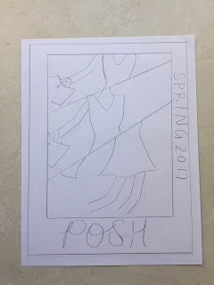
Double-page spread layout

Contents/Index page layout

Of course, these are merely the outlines. Once I start digitally designing my magazine, the pictures and colors combined with the layout will form the abstract, edgy look I am going for. Maybe I won't even use any of these sketches, but instead, I'll find something I like better on Canva (the platform I'm going to use), which might end up changing my whole layout. I will keep you all posted!

Thursday, March 23, 2017

Layouts, Layouts, and More Layouts

Now that the due date is approaching, I have to start thinking about my double page spread. A few weeks ago, my teacher assigned this article by The Guardian that gives tips for blogging, but I've also been using these tips to help me with my magazine. The article is absolutely amazing, it advises bloggers to write about what they love, to include lots of images, and to create catchy titles for posts, but in this case, I'm drawing inspiration from the tip that says "provide easy reading." The article suggests using bullet points and lists to grab people's attentions, a strategy that I'm feeling increasingly inclined to adopt. Harper's Bazaar does this really interesting thing called #THELIST, where they literally list cool trends, outfits, ideas, and guides depending on the category. Their list about spring 2017 trends is so on point and it really caught my attention since doing a spread about summer trends is a possibility for me. I love that the black/white, minimalistic design of the page causes the colorful pictures to stand out. In another article shown to me by my teacher, InDesign provides various ideas for magazine layouts, they even specifically include one of Harper's Bazaar #THELIST print layouts, instead of the digital link I used as an example above.


In the same article, InDesign also includes this layout from another one of Harper's Bazaar Magazines, where the text wraps around Alexa Chung's figure. This is a creative way to get out of your comfort zone and according to InDesign, it is "a great technique for better integrating photography with text to create a unified look."


Now it's time for me to think about MY layout, wish me luck!

Citations
Cowan, Katy. "Top Tips for a Successful Blog." The Guardian. Guardian News and Media, 17 Nov. 2011. Web. 13 Mar. 2017. <https://www.theguardian.com/culture-professionals-network/culture-professionals-blog/2011/nov/17/top-tips-successful-blog>.

Pieri, Kerry. "#TheLIST: 11 Spring Trends to Try Now." Harper's BAZAAR. N.p., 14 Oct. 2016. Web. 13 Mar. 2017. <http://www.harpersbazaar.com/fashion/trends/g6825/spring-trends-2016/>.

"Fresh Ideas for Improving Your Magazine Layouts." InDesign Skills. InDesign Skills, 24 May 2016. Web. 13 Mar. 2017. <http://www.indesignskills.com/inspiration/magazine-layout-design/#>.


Tuesday, March 21, 2017

Blessing in Disguise

Canva's design school blog has proved to be a blessing in disguise as I continue to develop my Foundation Portfolio. I've found such creative ideas and inspiration in those blog posts that I really just have to dedicate this post to share them.


This digital adaptation of a Vogue magazine cover by graphic designer Jessica Fecteau, uses face paint to bring visual interest to the image. The thick, diagonal lines meet directly in the center of the model's face, this emphasizes her bold features while also creating a sense of both parallelism and minimalism. This is an extremely creative way of transforming a plain picture into something compelling, without going over the top with details. Who knows? Maybe I will experiment with some face paint when I shoot. This magazine cover is found on one of the case studies by Canva's blog about design techniques, along with 49 other brilliant tips to transform a magazine covers.

This blog post by Canva, which I have referenced before, has mind-blowing layout examples that are perfect for those who are interested in digital and graphic designing. In my favorite layout for Dash Magazine, Canva advises readers to mix textures to create a visually appealing and abstract look. The pieces of different papers on, behind, and around the model make it look like a collage design. Even though I don't really know how to achieve this look, it still serves as a great source for creativity.


Citations
Gross, Rebecca. "50 Design Techniques That Made These Magazine Covers Awesome [Epic Case Studies]." Design School. Canva, 13 Oct. 2015. Web. 13 Mar. 2017. <https://designschool.canva.com/blog/magazine-cover-design/>.

Theodor, Veronika. "Creative Layout Ideas From 50 Beautiful Print and Digital Photo Collages." Design School. Canva, 01 Apr. 2016. Web. 13 Mar. 2017. <https://designschool.canva.com/blog/collage-ideas/>.

Saturday, March 18, 2017

Homemade feels

Now that we have the color palette down, we can focus on the font styling. Like every brand, I want my magazine to have a "signature font" for the title, headings, and certain texts in order for my audience to recognize it. An article about creative layouts from the Canva's design school blog gave me a brilliant idea about making the fonts seem like handwriting.


The handwritten aspects of the layout on the right makes it seem extremely distressed and anxious, while on the left, the handwriting is a little smoother and therefore classier. This emphasizes the difference in themes, as one is about fashion and the other is promoting a female music festival. In both, the handwritten fonts look as if they were written pretty fast, adding an unorganized, homemade, and abstract feel to each layout. Personally, this is certainly a feature that would visually attract me to a something, which is why I want to attempt to achieve this kind of design for my magazine.

If I do end up including a handwritten font, I would only use it for the masthead, headlines, and the article titles to give the magazine an abstract and creative visual appeal.  The actual text for the body paragraphs and the table of contents, however, will be in a font similar to sans serif or cambria, this is so people do not have a hard time understanding or reading.

In the long run, being picky about a font seems silly, but when creating the final project it is a detail that can either make or break your magazine. Think about it, when looking at something aesthetically pleasing, everything flows and comes together in perfect harmony. For a magazine, font style is an important element in reaching that "perfect harmony."

Citations
Theodor, Veronika. "Creative Layout Ideas From 50 Beautiful Print and Digital Photo Collages." Design School. Canva, 01 Apr. 2016. Web. 12 Mar. 2017. <https://designschool.canva.com/blog/collage-ideas/>.

Thursday, March 16, 2017

Bold and Bright

Piece by piece my Foundation Portfolio is coming together, but a big chunk that I haven't searched for is the color palette. As soon as I decided I was going to go for an edgy look, I new wanted bold and bright colors. When my teacher was giving a lesson on the importance of colors in media, she shared an Esquire article about the color palettes of famous movies, one of them being Moulin Rouge! (2001) directed by Baz Luhrmann.

The color palette in Moulin Rouge, as shown above, has a wide range of eye-catching, fun colors to depict the parties and the lifestyle that characterized the era. Looking at the colors alone, without the scene of the movie, they also carry a retro feeling that might appeal to my magazine. Even though the the color palette is darker than what I want, it does have similarities to what I'm visualizing. In my research, I also came across Pantone's fashion color report for this spring, which is more like a pastel version of Moulin Rouge's palette. Both of these color schemes are along the lines of what I want, so I'm thinking of combining the two of them while also adding my own little touch to make the them even more brighter and bolder. Every color in the magazine should captivate my audience, so in my opinion, using vivid (maybe even neon) colors for the clothes and the text will achieve just that.


Citations
Griffin, Elizabeth, and Adam Hurly. "50 Iconic Films and Their Color Palettes." Esquire. N.p., 22 May 2016. Web. 12 Mar. 2017. <http://www.esquire.com/style/news/g2760/color-palettes-iconic-films/?slide=46>.

Pressman, Laurie. "PANTONE Fashion Color Report Spring 2017." PANTONE. Pantone Color Institute, 23 Sept. 2016. Web. 12 Mar. 2017. <http://www.pantone.com/fashion-color-report-spring-2017?from=topNav>.

Tuesday, March 14, 2017

Work in Progress

What is a magazine without its content? As part of my Foundation Portfolio Project, I am required to include a table of contents and fortunately,  I woke up with all the inspiration I need. To start off, I jotted down some notes and ideas for content and articles that I may include in the table of contents or as my double-page spread:
  • Patterns, how to face the new pattern trend head on, tips on mixing & matching different patterns
  • Summer trends
  • Street style chic
  • Fashion month highlights
  • Accessories galore, styling hats/shoes/jewelry
  • Feminist fashion
  • Developing your personal fashion sense
  • Looks for less
These ideas regarding the content came to me fairly quickly, but how about my layout? This blog post by Canva's design school gives students, like me, examples and feedback on different types of designs for a contents page.

Background picture gives the page a dramatic effect
and contrasts sharply with the text

The large font and the bold page numbers, followed by the
titles of the articles, gives the page depth and makes it easier to read
Using Pinterest, I also pinned some of the appealing layouts I found onto my board.
Placing the word "index" on the spine of the magazine draws
the readers attention, including pictures makes the page more visually appealing


Minimalistic layout and bold text underscores the edgy/dark
theme of the magazine

Having all these resources to learn and draw inspiration from is really exciting, they really get all of my creative juices flowing. When I start designing, I am going to make sure to keep an open mind, using all the inspo I've seen and tips I've been given to create the perfect table of contents.

Citations
Maria Jose. "Designing the Perfect Table of Contents: 50 Examples to Show You How." Design School. Canva, 06 Jan. 2016. Web. 12 Mar. 2017. <https://designschool.canva.com/blog/table-of-contents-design/>.

Sunday, March 12, 2017

A Bit Unconventional

I know an essential part of choosing a genre may be exploring how to go against it. With that in mind, how will I challenge the conventional aspects of a fashion magazine?

Even though magazines similar to Vogue and Harper's Bazaar are usually known for their elegance and sophistication, they have released some issues with an "edgy" feel. This leaves me stuck at a crossroad and I'm not sure which way to go, its a battle between edgy vs. elegant, what would you choose? After "pinteresting" for a while, I've pinned onto my board a few of my favorite samples that I can use to make my decision.


Achieving an artistic look while remaining classy and fashionable is difficult, but after researching and comparing some layouts, I think I'm leaning more towards an edgy theme. I feel it will give me more leniency when editing and designing creative, abstract looks, after all, I love a great challenge!

If you've ever looked through a fashion magazine, you know they aren't exclusively about fashion. Even the most popular fashion-based magazines include elements of science, music, art, social issues,  lifestyle, beauty, etc. This website highlights the content of the most prominent magazines in the genre; for example, both Elle and Marie Claire discuss mainly fashion, but also contain information about relationships, politics, and women's issues. For my magazine, I'm most likely going to focus only on fashion. This is tricky, not only because it may narrow my audience, but because fashion often overlaps with the other topics I named above, so its easy to veer off topic. But I don't think it will set me back; instead, I think it will give my audience a greater incentive to buy it. There does not exist a magazine based solely on fashion, so for instance, those who do not buy Vogue, because they aren't interested in the aspects of science and beauty that are included, will feel an even greater appeal for my magazine. Still, I believe this will not take away from my project because readers of the genre will still be attracted because of the mere fact that it will be about fashion. The stylish tips, trends, and outfits I plan to include in my magazine will be able to appeal to my initial target audience, young adults to those in their 30's, so age and social class should not be affected.

Another unconventional aspect I'm going to try to achieve will have to do with the type of images that I will include. Usually, when looking at the front cover of magazines the models are facing forward, looking directly into the camera. In fashion magazines, the model is often times part of the brand and marketing strategy, so the focus of the image is both on the clothes and the models, which is why the models face is shown almost all of the time. For my magazine, my intention is to expose mainly the clothes, so in order to achieve this I will not show the faces of my models. By cutting off the faces of the models I hope to draw much more attention to the outfits and and the colors. Lets see how it turns out in a few weeks when I shoot....

Until next time!

Saturday, March 11, 2017

Thank You Google Translate

After an hour of translating fashion-related words from English to French to Italian, I finally came up with a name. When I chose fashion as the genre for my magazine, I pictured having a foreign name on the masthead, something elegant but also catchy. But after what seemed like three hours of translating words, everything seemed either too cliché, too long, or too hard to pronounce which resulted in frustration. Feeling a bit conquered, I took a loooong break.

Now, a day later, I came up with a whole new strategy. Instead of using a foreign word that few people would recognize, I figured my brand name should just be in English. Something short and sweet, but still classy. At least this way, my primarily American audience would be able to understand it. My idea of including a little bit of French or Italian would just have to be embedded into the magazine's text in phrases like "à la mode" or "chic."

Now for the great reveal! My magazine will be called..... drum roll, please..... Posh!
Sounds a little dull if I just say it like that, but trust me, once you see it on the cover page, with pictures and colors, you'll love it! As a matter of fact, the definition of the word "posh" is stylish and fashionable, so it's a perfect fit.

Using media kits from Vogue RussiaElle, and Interview Magazine, I've compiled a list of the usual demographics associated with fashion media outlets, specifically magazines.
  • middle and high social class
  • young adults and adults, ages 17-35
  • college educated
  • employed
  • primarily female
  • professional elite
  • people with creative vocations (designers, artists, stylists, photographers, etc.)
  • both single and married women
Citations
"Vogue - Audience." Conde Nast Russia. Vogue Russia, n.d. Web. 08 Mar. 2017.

"Elle Media Kit 2015." ELLE MEDIA KIT 2015 EDITORIAL MISSION (2015): n. pag. MediaRadar. Web. 8 Mar. 2017. <http://www.ellemediakit.com/hotdata/publishers/ellemk/advertiser/8231536/2818385/ELLE-2015-Media-Kit.pdf>.

"Media Kit Russia 2015." Media Kit Russia 2015 (n.d.): n. pag. Media Kit Russia 2015. Interview. Web. 8 Mar. 2017. <http://www.interviewrussia.ru/public/mk/mk_2015_eng.pdf>.

Friday, March 10, 2017

Cause of Death: Decisions.

As a naturally indecisive person, I am a bit anxious about starting this whole process. I know that every decision I make will eventually shape what will be my Foundation Portfolio, but how will I know what to do? How will I choose between two excellent ideas? Where will I find the inspiration I need? There's about 101 questions running through my mind right now, so in order to organize my thoughts I figured I should work in an inverted triangle method, beginning with the general details.

To start with, I chose to do a magazine layout for my Foundation Portfolio Project. Being better behind a computer than behind a camera, it was a clear choice. I knew my interest in graphic design would serve as motivation, not to mention that my dream job is to work for the marketing aspect of a magazine. 

Now, let's talk genres. I started by researching popular magazine topics, narrowing it down to music and fashion. On the music side of the equation, Billboard's December 2011 issue dedicated to Adele really drew me in. Adele's photograph is extremely appealing as she looks straight into the eyes of the reader with a puzzled expression, and the graphics surrounding her is something similar to what I would like to do. Plus, who doesn't love Adele? In respect to fashion, thanks to Pinterest (my go-to), I just had to type in "fashion magazine covers" in the search bar to feel a sudden burst of inspiration. After scrolling I came across Vogue Italia's September 2010 issue featuring Miranda Kerr, the combination of the 3-D effect on the cover image with the nude color palette looks cool even without 3-D glasses! Miranda is also looking straight into the camera, with a small smirk, giving off a sense of class and gracefulness to visually attract readers. Not to mention the puppy, cuteness overload!


Since following fashion has been one of my passions for the past few years, it didn't take long for me to make this decision. This portfolio is a unique opportunity to be able to show off my passion, my ideas, and my knowledge about fashion and media. If only every school project could be based on a student's individual passions!

So what's next for my Foundation Portfolio? Before I actually start trying to visualize and design my magazine layout, I want to begin thinking of a name or a color palette. At this point, I'm not sure exactly what comes next, but I do know that every single decision is at my discretion (overwhelming, but also pretty exciting). Get ready to follow me on this journey and see my inner most thoughts as I complete my magazine!

Citations
Shepherd, Julianne Escobedo. "'21' And Up: The Year of Adele Cover Story." Billboard. N.p., 9 Dec. 2011. Web. 08 Mar. 2017.

"Vision of Femininity." Vogue.it. Vogue, 28 Aug. 2010. Web. 08 Mar. 2017.